Device Viewport Emulation
Your sites may have different issues at various screen resolutions because they don't look the same on a laptop, an iPhone, a Kindle Fire, or a Galaxy Note.
When running an accessibility report, you can choose from a list of popular devices to emulate their screen resolution, device scale factor, User Agent string and orientation.
Emulating a device viewport
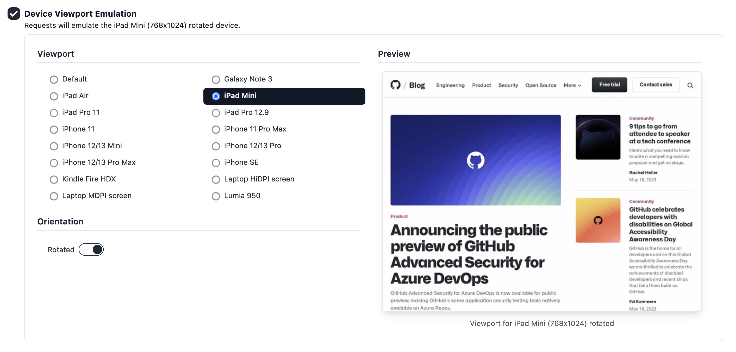
To emulate a device viewport, just enable the Device Viewport Emulation when creating a report, choose a device from the list, and optionally check the rotated option:
Currently supported devices
| Name | Width | Height | Device Scale Factor |
|---|---|---|---|
| Default | 800 | 600 | 1.0 |
| Galaxy Note 3 | 360 | 640 | 3.0 |
| iPad Air | 820 | 1,180 | 2.0 |
| iPad Mini | 768 | 1,024 | 2.0 |
| iPad Pro 11 | 834 | 1,194 | 2.0 |
| iPad Pro 12.9 | 1,024 | 1,366 | 2.0 |
| iPhone 11 | 414 | 828 | 2.0 |
| iPhone 11 Pro Max | 414 | 896 | 3.0 |
| iPhone 12/13 Mini | 375 | 812 | 3.0 |
| iPhone 12/13 Pro | 390 | 844 | 3.0 |
| iPhone 12/13 Pro Max | 428 | 926 | 3.0 |
| iPhone 14 | 390 | 663 | 3.0 |
| iPhone 14 Plus | 428 | 745 | 3.0 |
| iPhone 14 Pro | 393 | 659 | 3.0 |
| iPhone 14 Pro Max | 430 | 739 | 3.0 |
| iPhone 15 | 393 | 659 | 3.0 |
| iPhone 15 Plus | 430 | 739 | 3.0 |
| iPhone 15 Pro | 393 | 659 | 3.0 |
| iPhone 15 Pro Max | 430 | 739 | 3.0 |
| iPhone SE | 320 | 568 | 2.0 |
| Kindle Fire HDX | 800 | 1,280 | 2.0 |
| Laptop with HiDPI screen | 1,440 | 900 | 2.0 |
| Laptop with MDPI screen | 1,280 | 800 | 1.0 |
| Lumia 950 | 360 | 640 | 4.0 |
Check the full list of supported devices in Rocket Validator.